The single most important thing on your website.
Pop quiz time! Before you start groaning, it’ll be easy – I’ll make it multiple choice. Ready?
What’s the most essential element of your website?
- About page
- Contact page
- Photos of your team
- The CTA
- All of the above
If you guessed D, the CTA, you win! No need to keep reading – close that computer and go buy yourself a pastry. I’d say your work is done for the day.
If, however, you said to yourself “what the heck is a CTA,” you’re in the right place because you’re about to find out.
What’s the big deal about a CTA?
Have you ever surfed the web for hours, found exactly the right thing you were wanting, only to sink into a very depressing hole because you couldn’t figure out what to do next? There didn’t seem to be a real phone number or even a button to connect you with the company?
CTA stands for Call To Action and even though it’s the most important element on a website, it’s also one of the most overlooked parts in website content and design.
When someone visits your website, they’re showing a measure of intent – they’re there because you have something they want. But since your visitor is new, they may not know what to do once they find what they want.
It’s your job to tell them what to do.
Not only does it help out your customer and alleviate any purchasing frustration, but the CTA is actually what clinches the sale for you. By clearly and confidently leading your customer through your sales process, you’re reducing the chance your customer is going to bail and go look for someone who’s easier to use.
How to make an awesome CTA.
You’d think telling your customer what to do would be pretty easy, right? Just put a standard “contact” button or a phone number with an email address and that should be good…right?
While a phone number and email is good, it’s the bare minimum. A good CTA has five elements:
- It has a benefit-driven, persuasive element.
- It’s clear and intentional.
- It’s used with strategic frequency.
- It’s easy to use.
- It gives your customer options.
Let’s take a moment with each of these.
How to make your CTA persuasive.
I think one of the hardest parts of writing for your business is turning facts into benefits. But with your CTA it’s important to talk only in benefits – how are you making your customer’s life better?
For example, if you’re a certified public accountant, it would be tempting to simply say “Schedule your appointment now.” But you give me no reason why I should do that. Instead, consider what sets you apart and why I should choose you over a competitor.
So, perhaps you’re not the cheapest accountant, but you’re really good at finding tax benefits for small businesses that most other accountants overlook. Your CTA could possibly say something like “Invest in your business instead of Uncle Sam. Schedule a small business tax audit today.”
(P.S. I know very little about accounts, so please, no hate mail if that example is totally absurd.)
Which ties a bit into the next CTA element – making your CTA clear.
How to make your CTA clear.
I’ll be the first to admit that when I’m in internet surf mode, my brain’s on cruise control, mush brain, if you will. If I’m looking for something specific, I might be more engaged, but most likely I’m collecting info, taking in the bare minimum.
My mush-brain needs you, the website owner, to wake me out of my stupor. Pretend I’m an 8-year-old boy with ADHD and tell me what to do in your best nice-but-firm mom voice.
So when it’s time for me to take action, be clear and direct. Consider what you want me, the visitor, to do, and then say it as explicitly as possible. And not just with an unmistakable button, but also with a little extra persuasive text to get me up to speed with the process you’d like me to take.
Here are a few obvious examples for clear button language:
- Learn more
- Read more
- Buy now
- Visit
- Donate
- Call now
- Connect
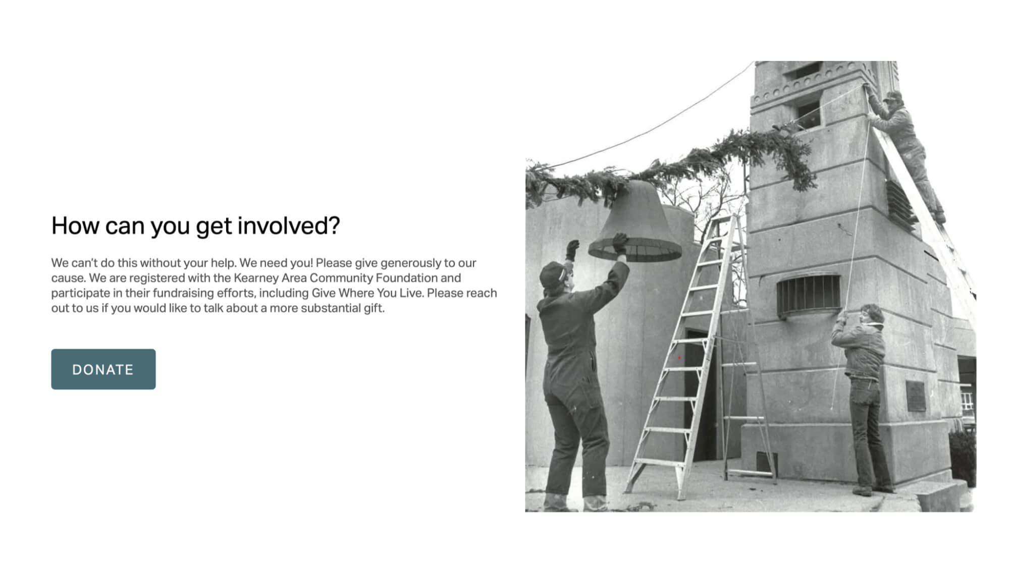
For a great example of the leading text being direct (before the actual button), https://harmonsonotorium.com is a website devoted to the restoration of an outdoor music and theater venue. After they built the argument for why their project matters, they created a section for their CTA.

The combination of their header, “How can you get involved?” with a clear button in all caps that simply commands to “Donate,” is a perfect example of keeping it simple, clear, and direct. If instead they had put “Learn more” as a CTA here, it wouldn’t be nearly as effective.
So to recap, make your CTA’s simple and tailored to what actions make sense for your website.
Strategic Frequency – Where to place your CTA’s.
Since we’re pretending I’m an 8-year-old boy with ADHD, you’re going to have to tell me what to do more than once. Probably at least three times, depending on how much other information you’re giving me, too.
But don’t be haphazard in this. Put a CTA where it makes sense in the context of building out your “argument” for why your visitor should pick you.
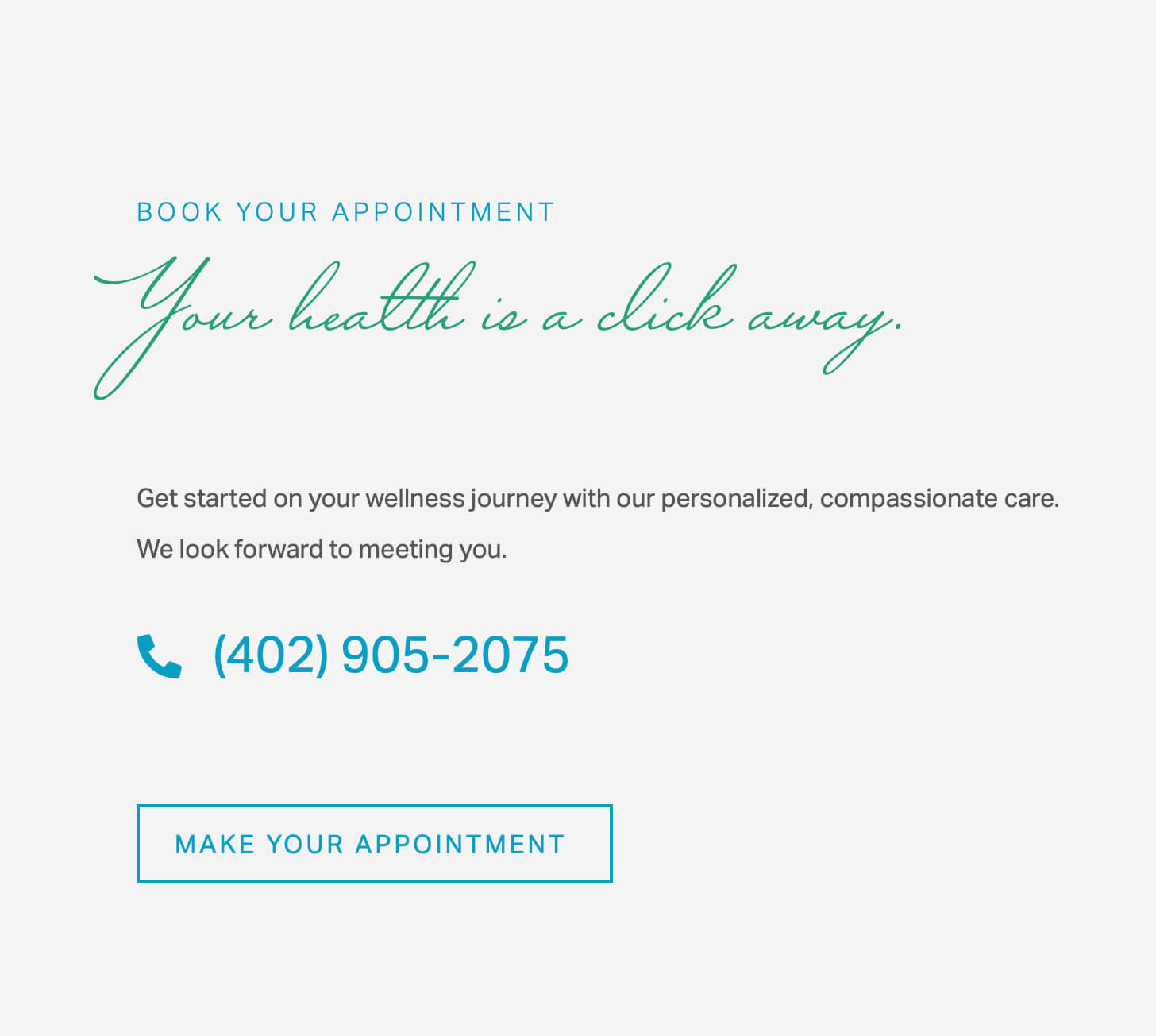
Miracle Hills Clinic – https://miraclehillsclinic.com – is a great example and I recommend you visit their site to get the full idea of what I mean. But here are a few screenshots as I scroll through their home page.
Their main CTA is “Book Appointment” and is clear and always easy to find.
CTA at the very top → this is ideal for their patients who just want to schedule an appointment asap. They don’t need to gather any info, they just want to get their time on the books, right now.

CTA in the middle of the page → This is perfect for patients who might have heard about the clinic but probably haven’t been before. They’ve come to the website to settle any uncertainties.
Since it’s geared towards visitors who haven’t been before, this CTA has a bit more persuasion to it.

CTA at the bottom → Great for the visitors who want to have every last bit of information before choosing the clinic. The final CTA at the bottom is essentially the culmination of your persuasive argument for why you’re the best option for what they’re looking for.

Other options.
Every business and website is different, so be sure to put your CTAs where it makes the most sense for you. For example:
- Amazon puts their CTA on the right-hand side.
- First time visitors to retail websites often get greeted with a newsletter pop-up CTA.
- Many service-based websites put a CTA in the header image.
- Many businesses that have a long sales journey use a live chat option at the bottom right of their website.
Make your CTA easy to use.
You’ve got a clear CTA, it’s in all of the right places, now what?
Take the extra time to make your CTA process easy as a dream. Sometimes it might make sense to invest in an extra service to help you with this.
If you’re scheduling appointments, Calendly is a great industry standard. It’s either free or very affordable and integrates with your calendar really well.
If you’re wanting to offer live chat options, there are a ton of competitors out there, but at Control Yours we use HelpScout and have been quite happy with it. We’re able to customize our live chatting options based on who is in the office, and it’s worked well.
And if you sell products, make sure your checkout process is so easy it’s almost unnoticeable. Be sure to go through your checkout process yourself to test how easy (or not) it is.
It gives your customers options.
Last, a great CTA takes into consideration that not all of your visitors are in the buying or scheduling mood, they may just be collecting information. However, don’t let those visitors fall through the cracks — there’s plenty of opportunity to connect with those customers too.
For example, if you’re a contractor and a homeowner is considering doing a bathroom renovation or a small add-on, they may not be quite ready to pick up the phone and have you come out and give an estimate. So, they’re not going to click on your “Call now for a free estimate” CTA just yet.
However, they may be very interested in downloading your “5 Ways to Prepare for a Home Renovation” checklist that you have available (you have one available, right 😉?). That way once they are ready, not only will you have established that you’re trustworthy and helpful, but they’ll also have all of your information on the checklist you created.
It’s definitely worth your time to consider ways you can connect with and be helpful to the browsing visitors on your site.
We’ve got your CTA strategy.
If you’re doing a website design or redesign with us at Control Yours, your CTA strategy is already covered. We believe in a good CTA strategy so much, it just comes naturally to us.
But if you’d like to rethink your CTA and want to know how to get started, we’d love to talk with you!
Schedule a phone call in Calendly and we’ll make your website’s CTA strategy a sales dream.


