7 design trends worth your attention
At the risk of someone hating me for saying this, 2019 is around the corner. ?
I’m not a huge resolution person, but I am a HUGE planning person. I like to know where I’ve come from and where I’m going. This time of year I love to nerd out on trends and assess which ones are worth it and which ones to toss.
And, lo and behold, it seems like 2019 has some pretty decent design trends to pay attention to, especially for small businesses.
From the bird’s-eye view, the trends are theming towards usability and the user experience. As a small business, this is great news. When your website can be user-centered AND hip, that’s a win.
What I mean about usability and user experience is that designers are more and more focused on how to connect with your visitors and make your site engaging and memorable, which is exactly what you want to increase engagement and establish trust in your audience.
If you’re considering a website redesign in 2019, or even looking for simple ways to improve what you have, here are 7 trends that are worth pursuing.
1. Relatable Content.
The internet is getting more personal. I mean, not too personal, we don’t need to know it all, but it’s time to let the personality of your business shine. Your customers are more likely to choose YOUR product over your competitors if they know and trust you.
So pull back the curtain a little and let your customer get to know you. Fun bios, great blogs written in your voice using your knowledge and experience, testimonial videos, animated gifs, all help your online visitors know who you are, not just what you do or sell.
Gix Logistics, one of our clients has been ahead of this curve for a while. Their website oozes personality. Check out their team page:
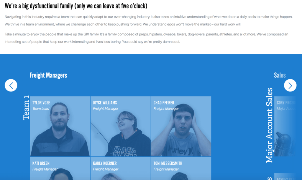
I mean, what company wouldn’t want to work with such fun, hardworking people?
2. Simplicity, white space, and meaningful imagery.
I’m going to let Michael, one of our graphic designers, talk about this one:
“The web is so congested it can feel like you’re looking at a kaleidoscope every day for 8 hours. So websites that can utilize negative space and simplicity feel much more comfortable, healthier, and less claustrophobic. It’s all about trying to make the virtual feel more natural and organic.”
This also means that stock photography is out and real photography is in.
It’s probably not fair to screenshot Apple since they’re the Rulers of All Minimalism, but I’m going to do it anyway.
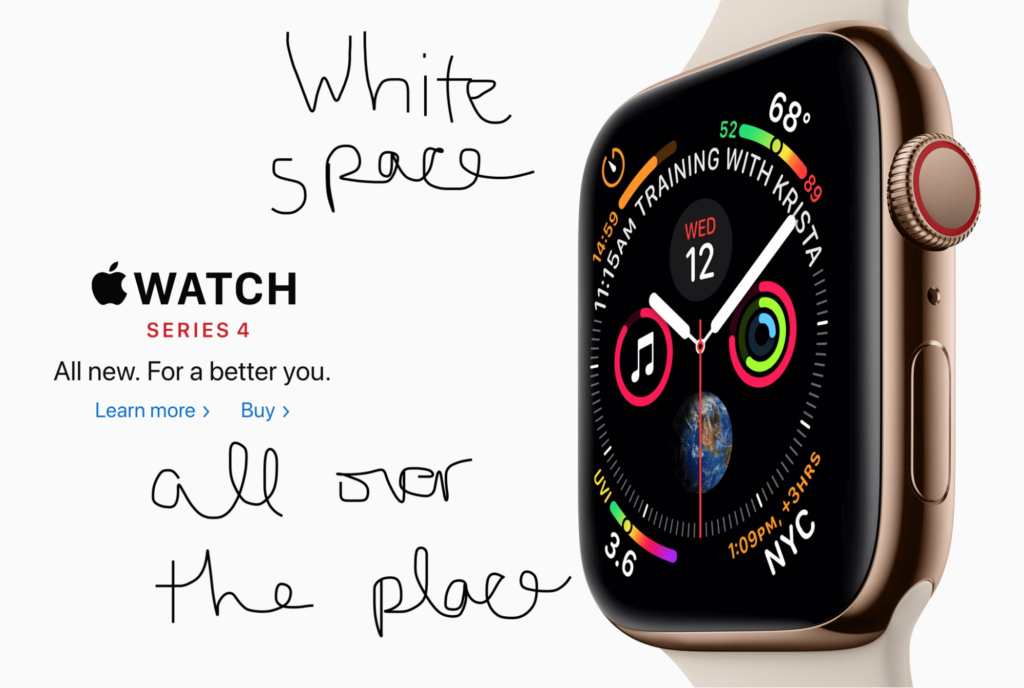
So little imagery and text, but such a powerful way to display the product.
3. The epic scroll.
Back in the day, you’d try to get everything in “above the fold” – where the screen stops. But now that there are so many sizes and shapes of screens, designers are taking advantage of people’s new acceptance of scrolling.
As a small business, you can maximize on this by crafting your visitor’s journey. Now, instead of your visitor be-bopping through each of your pages, gathering snippets of information in whatever fashion they click, a long page guides the visitor through your story as you craft it. If you’ve got a good hook at the top of your page, your visitor is likely to keep scrolling, gathering information in a logical way until you can get them to a strong call to action at the bottom.
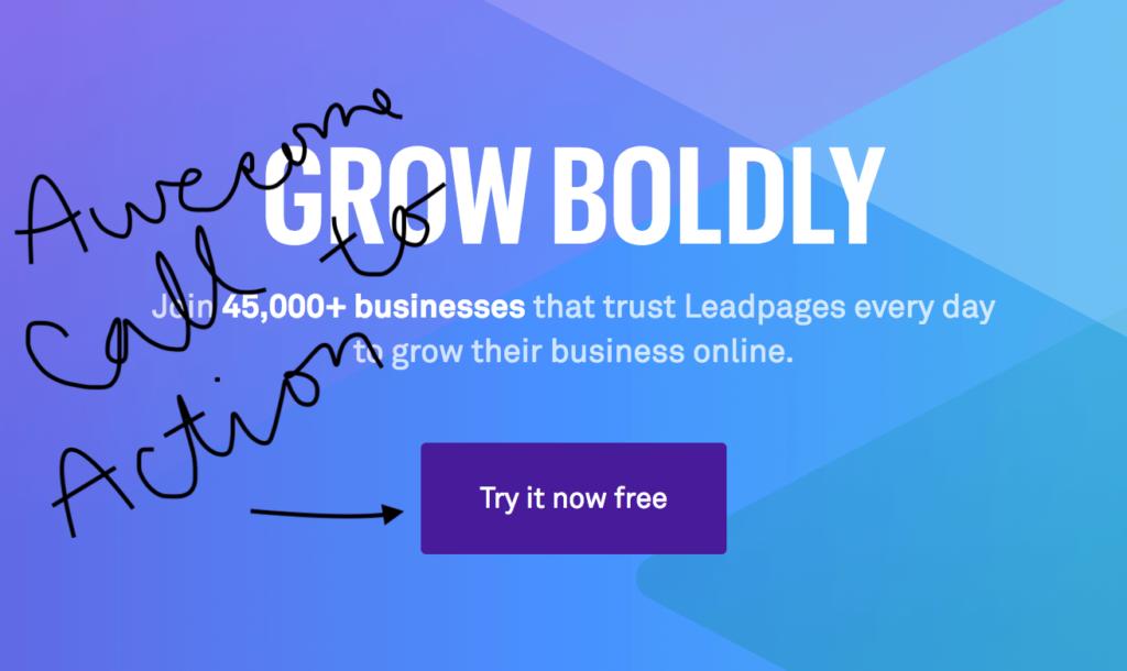
Just take a look at the homepage of the hugely popular www.leadpages.net. They’ve got it all — testimonials, a how-to video, features, and examples until they inspire you to try it for free at the end of the epic scroll.
4. Asymmetry
To help guide a visitor through some of those extra long pages, designers are using asymmetrical columns (think of lines on a slant) instead of traditional block columns.
Take a look at www.stripe.com’s home page:
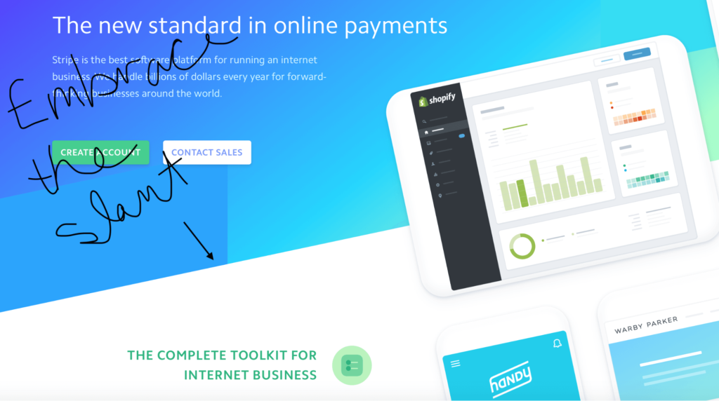
The asymmetrical column lets you know there’s more coming and maintains a nice flow of information. I like it.
5. Animation
This trend is absolutely delightful. There is no better way to increase interaction and engagement than to add subtle, meaningful animations throughout your website.
Stripe totally nails this. Navigating through their site, their icons have fun movement, their graphs are animated, and their information even arrives on the page in an engaging way. It makes a user want to stay and discover what’s next.
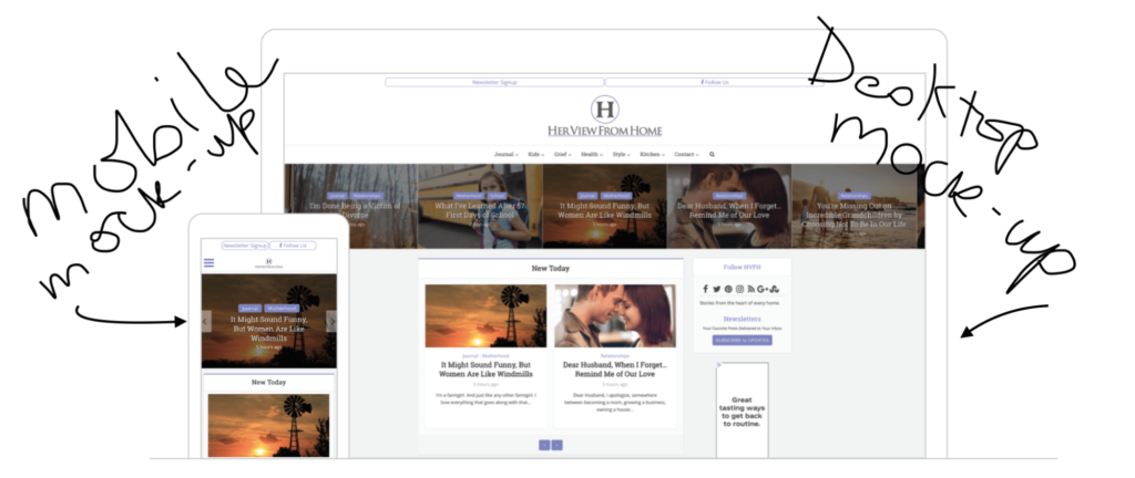
6. Mobile friendly
Mobile friendly has been a thing for a while now, but designers are making it more of a focus by creating mockups specifically for mobile. Even pages intended for desktops are being designed with how it will translate to mobile.
7. Chatbots
Like it or not, chatbots are going to stick around for a while. As you well know, most businesses can’t employ customer service staff 24/7. Chatbots are currently the best way to help out a customer when they’re shopping online at 2 am and can help you do some of your marketing legwork while you’re getting some much-needed rest.
BUT, the cool thing is that they are constantly improving, and they’re more helpful to both you and the customer than they have ever been.
Drift is one of the more popular chatbots out there. They try to keep it natural, helpful, and allow you to craft your messages.
![]()
POP QUIZ:
Quick! Who can tell me what design trends Drift’s website uses?
If you said numbers 1, 2, 3, & 7, here’s your virtual high five and fist bump ??????!
While some of these trends might need a complete redesign for you to implement, things like relatable content and chatbots for better customer service, are something you can do on your own.
However, if it’s been a while since you’ve taken a good look at your website, it might be time for a refresh.
So, what are you going to do to kill it online in 2019?
Send us a message and tell us your ideas! If you’re not sure, give us a call or schedule a meeting with us. Brainstorming over coffee is pretty much what we’re all about. ?
