Remember the heyday of the reality TV makeover show? Ah, the early 2000s …. a truly magical time, when there was no room, no home, no tragically dated or dowdy wardrobe that could not be radically transformed in 60 minutes ⏱, including commercial breaks. ?
The premise behind these shows was sort of unrealistic and silly – of course, it’s never that simple. You can’t really remodel a whole house in three days – not unless you have a huge crew working round the clock and money is no object.
But there’s a basic grain of truth there amid the fluff – the idea that updating, refreshing, tearing apart and rebuilding can transform the way you see the world and the way the world sees you.
So let’s apply this idea to web design. Many people want their website design to be a sort of “one and done” experience. Put the elements together, put it on the web and hope it works. That would be nice, right?
But good web design evolves – it needs regular maintenance and updating.
Picture your website as the front door of your business. Because the vast majority of potential customers will visit your website before they ever visit your physical location, it really is the primary impression someone will have of your company.
So – how can you make sure that your website is the kind of front door that makes a new customer want to walk right in and stay a while?
Let’s go over some basic elements of modern, thoughtful web design.
Choosing Colors
Color theory ? – surprised that this field of study even exists? ? Yep, you bet!
Why?
Because color really affects our opinions, perceptions and behaviors on a largely subconscious level. Color can affect your mood and motivation. It can be used to evoke a feeling or a memory. And it’s a huge factor in creating and building a brand that is memorable to your customer.
Think about the colors of your favorite sports team.
For us Nebraskans, red and white (scarlet and cream, if you want to get technical) instantly refer us to the University of Nebraska Cornhuskers. Say the words “Husker Red” in Nebraska and anyone who’s lived here can picture the exact shade you’re referring to.
The colors you use should create a positive, memorable impression on a new visitor to your site.
So, how do you choose the best color palette for your website?
Choose colors that reflect your product and speak to your clients. For example, if your business is giving guided tours of national parks, bright, loud neon shades would be strange and out of place on your website. However, complementary tones that reflect the natural environment would be spot on.
If you ever get stumped by picking colors, try consulting the classic color wheel.
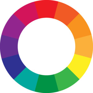
There are three basic principles for choosing colors that work well together. Analogous colors are any three shades that exist side by side on the wheel. Complimentary colors are shades that exist directly opposite each other on the wheel. The third principle is to refer to nature. Look around at the colors that occur together in the natural world ? and use those as inspiration for harmonious combinations.
Creating and Arranging Content
When we talk about content, we’re talking about all the words and images on your website. From a design and aesthetic standpoint, you want to position your content in a way that is both visually harmonious and easy to navigate for the user.
When a new visitor lands on your home page, what do they see first?
- Is your brand clearly represented and visible?
- Is it hard to find basic information?
- Is there a lot of visual and textual clutter?
We have two great blog posts on creating engaging content and hiring photographers – take a look at those for extra credit ?.
Embracing White Space
Sometimes it’s tempting to look at a blank, fresh website template and panic ?. Just like that big, blank wall in your home that drives you crazy, the impulse can be to cover it with something – anything – all the things! ? Maybe because you don’t know what else to do with it, right?
But when it comes to web design less is more.
Stick to your chosen color palette. Create content that communicates what a new customer needs to know, but don’t feel pressured to add every possible detail.
Short paragraphs, plenty of white space and a single, classic font can make your site easy to navigate and visually pleasing.
But let’s face it – making design decisions when you’re not a professional designer can be challenging.
If your website needs a makeover and you’re not feeling confident enough to DIY, we get that!
If you’re thinking that it’s time to call an expert, make sure you come back next week and check out our advice for communicating with a graphic designer.
In the meantime, how about a quick and easy website check-up?
We cover aesthetics and design – including three options for updating your site’s look – in our Website Assessment Guide! Plus, you’ll get the rest of our expert advice on content, online visibility and more! Download the Guide here!
Rather talk to a real person? Call or send us email – we’d love to talk about your project! ?
